
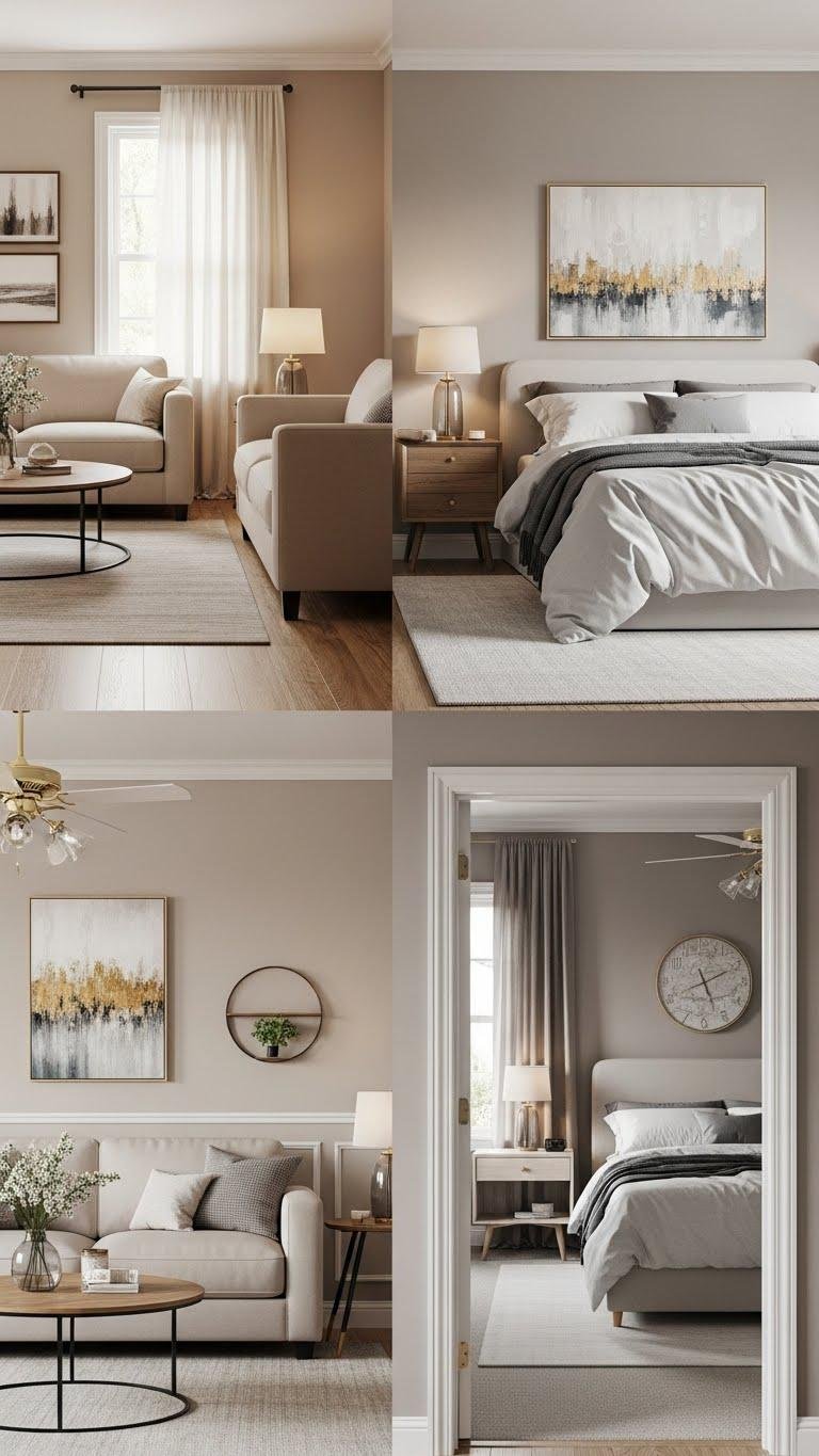
You’ll find neutral decor isn’t about beige everything but about a careful trio of tones—core neutral, lighter value, and a deeper accent—that create calm, cohesive rooms. Start with matte-painted walls, warm white millwork, and layered textures like linen, wool, and woven rugs to keep spaces lived-in yet refined. These 25 ideas show simple swaps and finishes that make neutral schemes feel intentional and effortless, and they’ll change how your home flows.
Choose a Greige Base for Timeless Sophistication
When you start with greige—a balanced blend of gray and beige—you give your space a flexible, timeless backdrop that flatters both warm and cool accents.
You’ll anchor rooms with greige textiles and curate greige artboards to build cohesive mood. Opt for layered textures and purposeful contrast so your home feels open, calm, and ready for personal expression without dictating how you live.
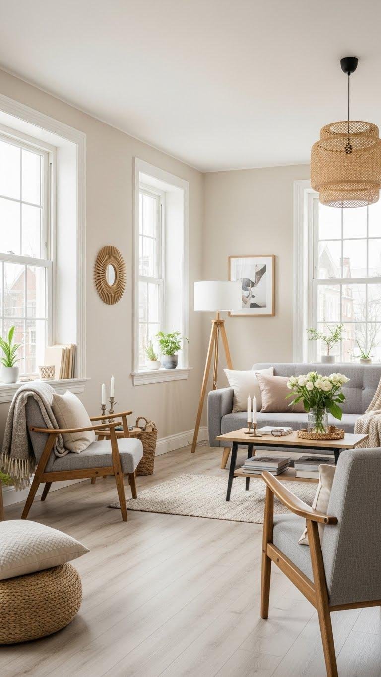
Layer Warm Whites for Airy, Cozy Rooms

Although neutral, warm whites bring a room to life by reflecting light while keeping the mood cozy, so start by selecting one dominant warm white for walls and a slightly different tint for trim and ceilings to create gentle depth.
Pair sun kissed plaster textures with creamy linen fabrics and natural wood accents.
You’ll create airy, inviting spaces that feel liberated and refined.
Paint Millwork in Soft Neutral Tones
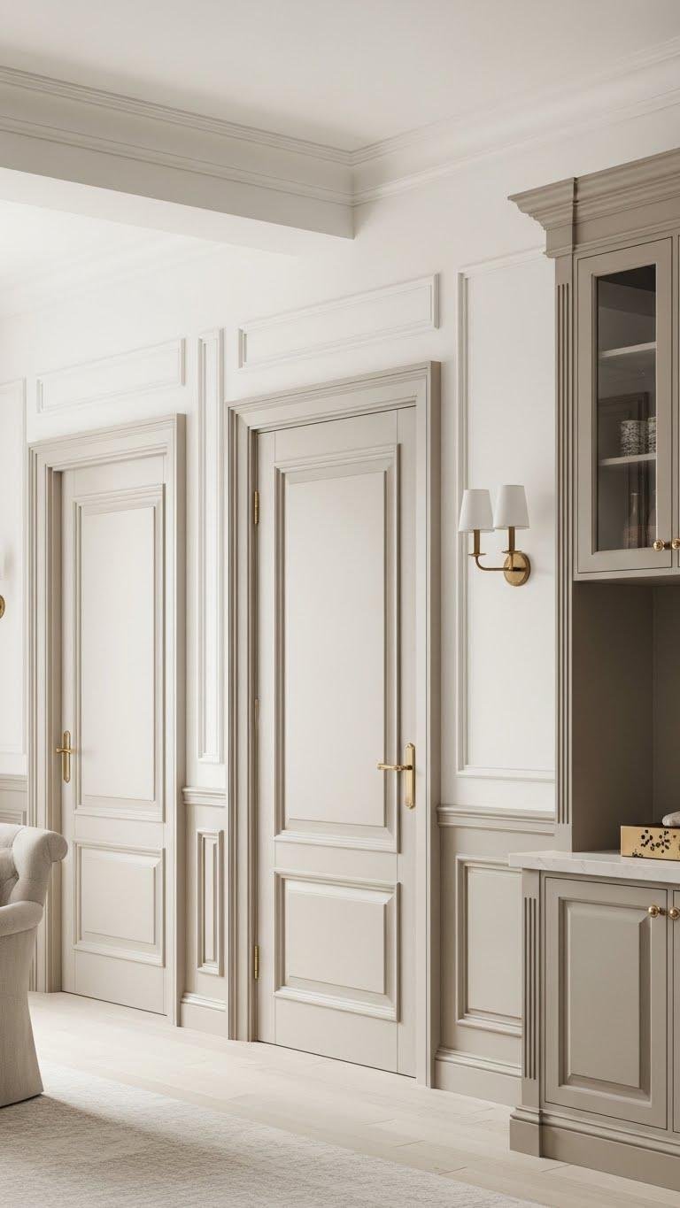
If you want millwork to feel intentional rather than an afterthought, paint it in soft neutral tones that complement your warm white walls and add subtle contrast.
Choose soft taupe for depth or muted almond for warmth; both unify trim, doors, and built-ins without dominating.
This approach frees the space visually, highlights architectural detail, and keeps your palette calm, adaptable, and effortlessly refined.
Use Swiss Coffee on Walls for Natural Light Glow
Want your rooms to feel brighter without looking stark? Use Swiss Coffee on walls to reflect a natural lightglow while keeping warmth. You’ll enjoy creamy undertones that read soft against furnishings, freeing you to mix textures and crisp accents.
The subtle warmth preserves openness without clinical whiteness, so you can craft a calm, liberated space that feels effortless and welcoming.
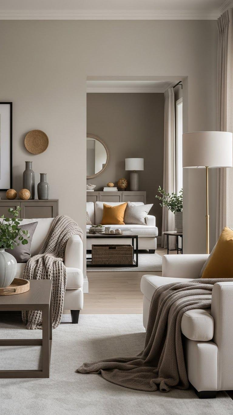
Anchor Living Rooms With Taupe Accent Walls

After you’ve warmed a room with Swiss Coffee, anchor the space by painting a single wall in a grounded taupe to create depth and focus.
You’ll balance that wall with taupe textiles—throw pillows, a rug or a linen sofa—to unify the palette. Add subtle accent lighting to highlight texture and create mood, letting the restrained scheme feel deliberate and liberating.
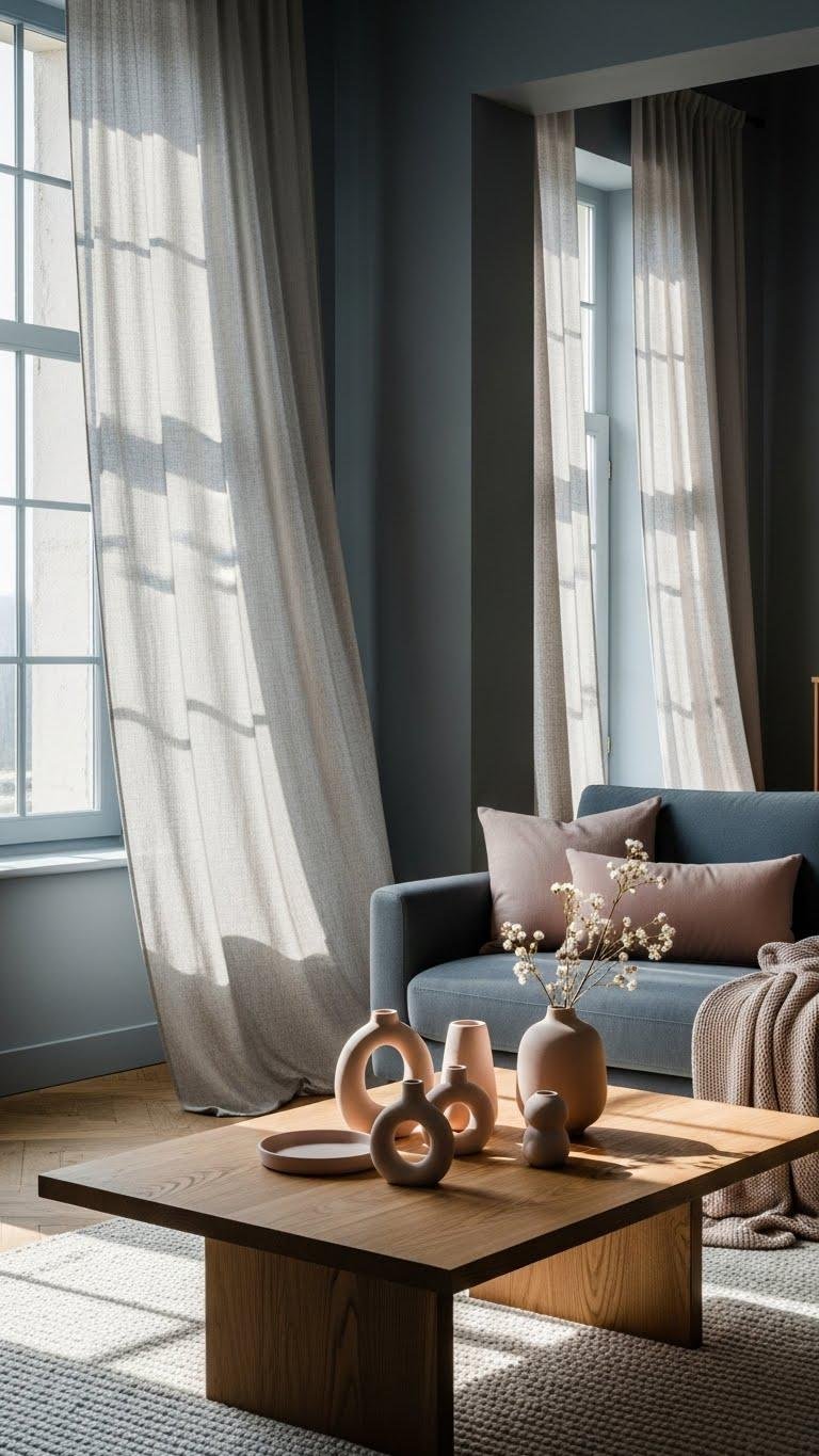
Pair Linen Curtains With Pale Fresh Neutrals
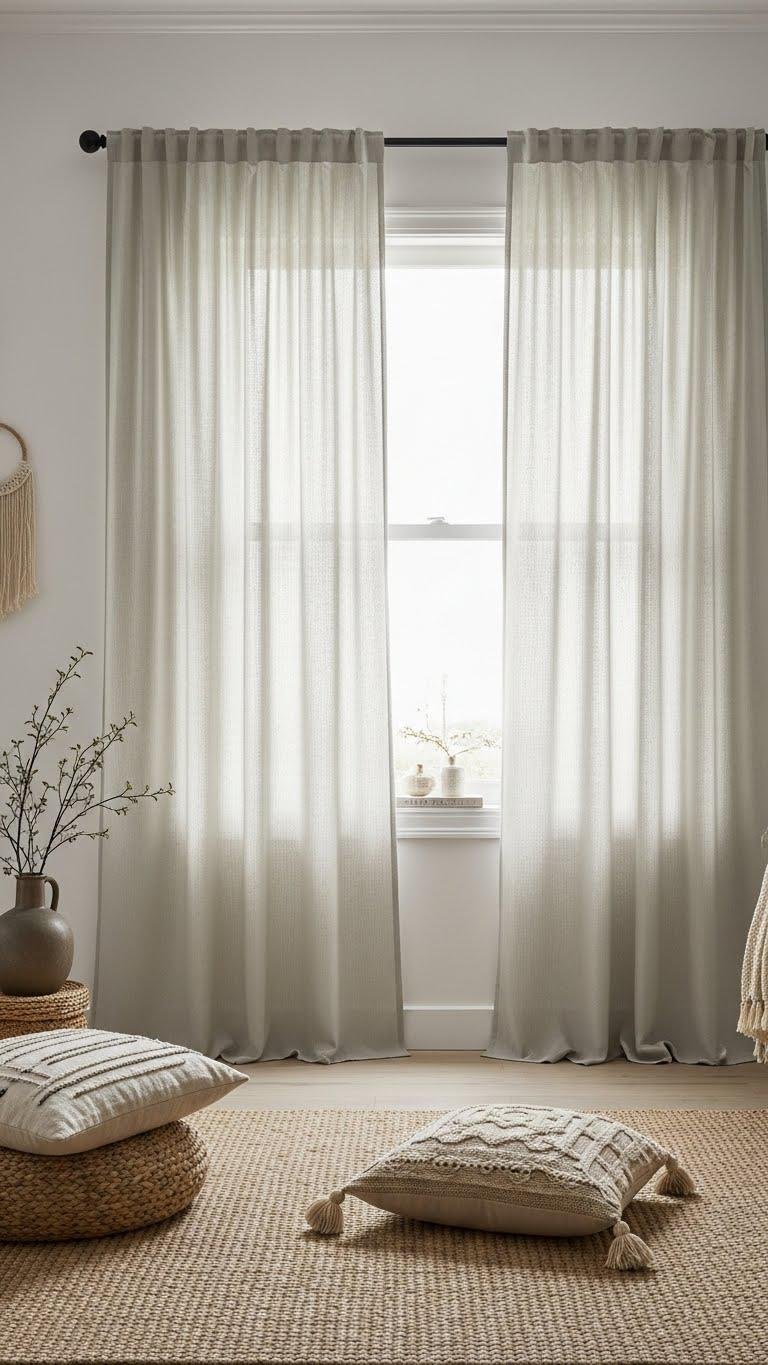
With soft linen curtains, you’ll introduce breathable texture that lifts pale, fresh neutrals without overwhelming them.
You’ll choose linen sheers to filter light, maintain openness, and underscore pale palettes with subtle movement.
Keep hardware minimal, hang high to elongate walls, and layer natural fibers for depth.
The result feels liberated, calm, and intentionally simple—your space breathes without fuss.
Introduce Blush-Infused Neutrals for Subtle Warmth
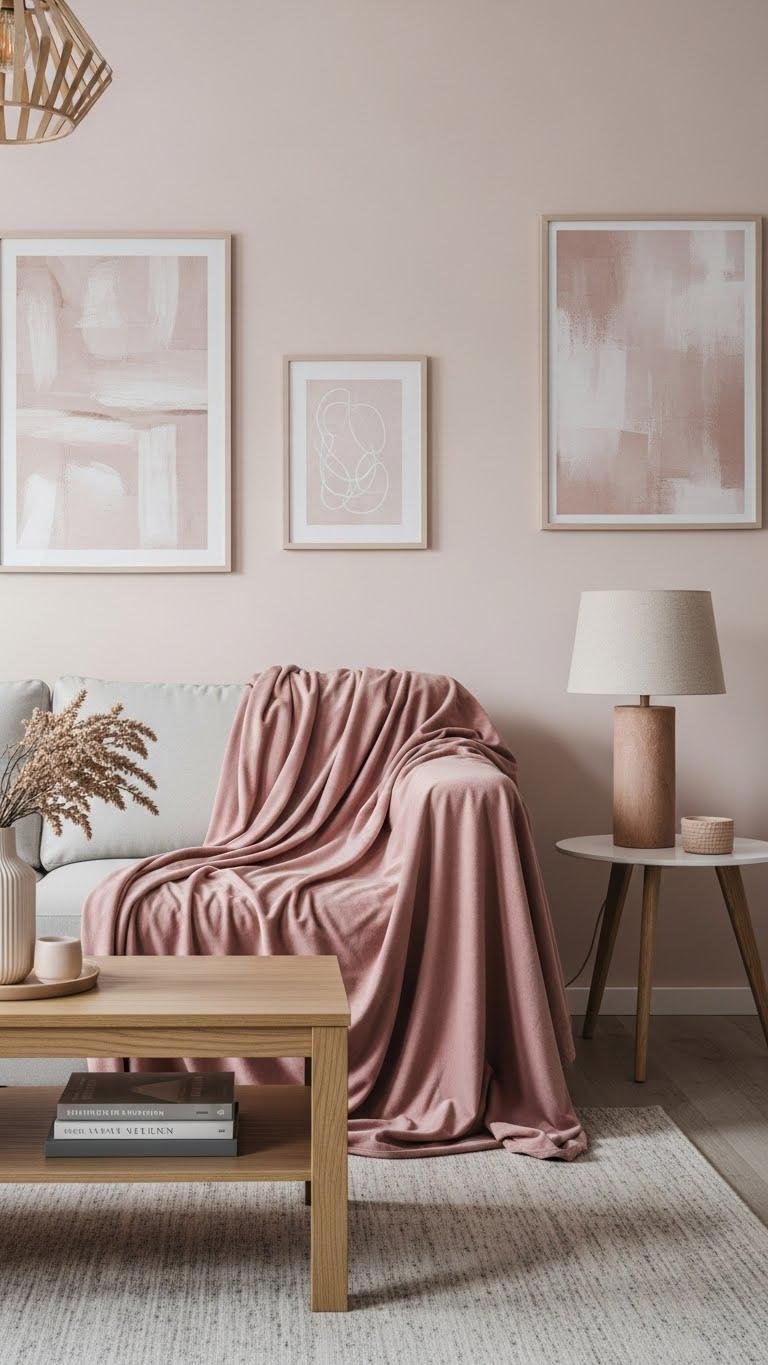
When you layer soft blush tones into a neutral palette, they add a whisper of warmth that feels deliberate rather than decorative. You’ll lean into a subtle blush undertone across walls, throws, and art, choosing pieces that don’t demand attention.
Mix matte surfaces with velvet textures for depth, and let restrained pinks free the room from starkness while keeping the mood calm and open.
Combine Muted Earthy Blues as Almost-Neutrals
If soft blush tones warm a room, muted earthy blues cool it with a grounded calm that reads almost neutral.
You’ll choose muted denim and slate whisper to craft airy, liberated spaces that don’t demand attention. Layer linen, matte ceramics, and warm wood to keep the palette serene. Use accents sparingly so the blues act like a quiet, freeing backdrop.
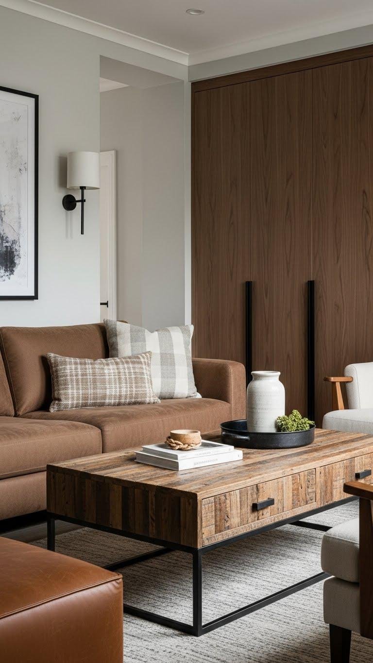
Ground Bedrooms With Soft Pashmina Browns

A soft pashmina brown anchors a bedroom like a well-worn throw, giving the space instant warmth and tactile depth without overpowering other elements.
You’ll layer pashmina textiles on bedding and seating to create subtle contrast with linen and matte woods. Embrace varied brown undertones—cocoa, taupe, chestnut—to ground the room while keeping lines clean, light flowing, and choices intentionally spare.
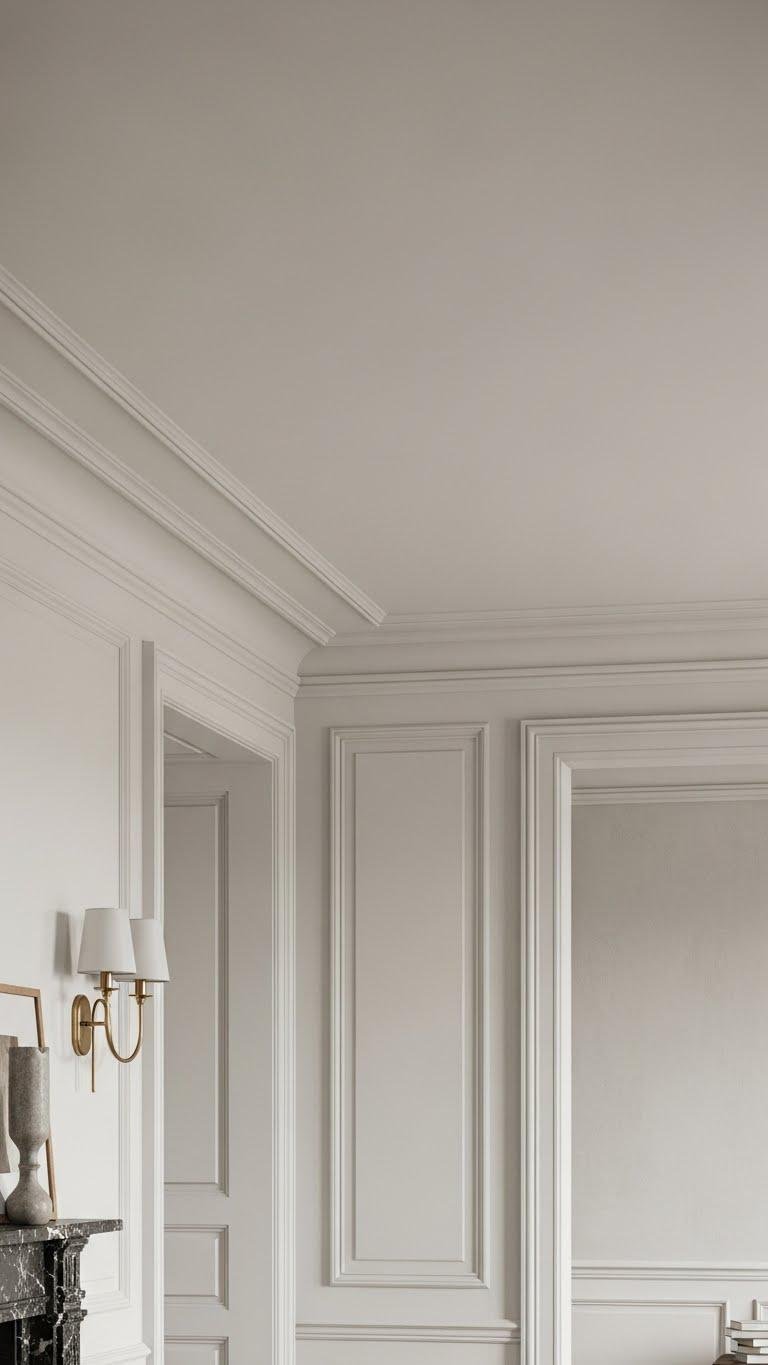
Opt for Off-White Ceilings and Trim With Character
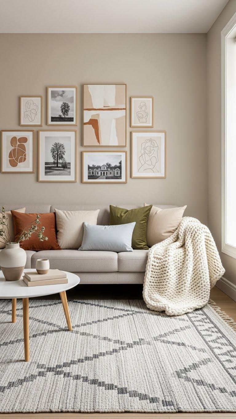
Mix Textured Wool Rugs With Greige Palettes
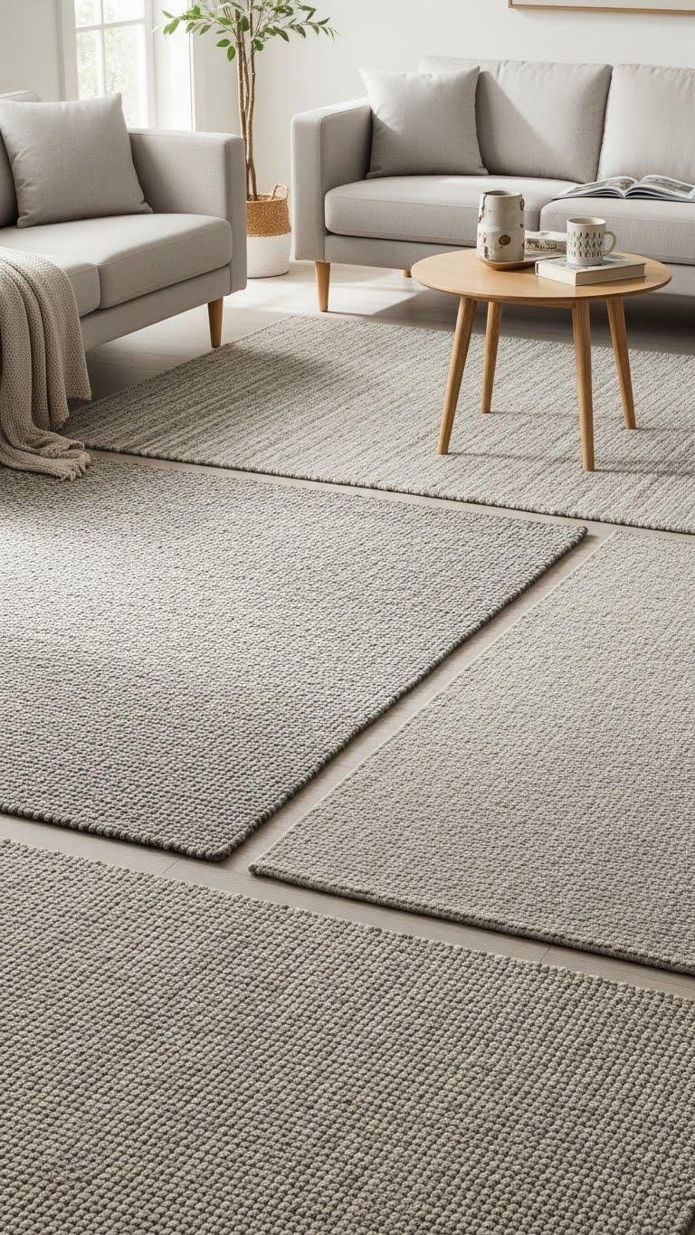
Bring textured wool rugs into a greige palette to ground the room and introduce tactile depth without disrupting the calm. You’ll balance handwoven textures with subtle neutral undertones, choose pile height for comfort and movement, and secure layers with a rug pad to prevent slipping.
Keep furniture silhouettes light, repeat materials sparingly, and let texture define freedom within a restrained, cohesive palette.
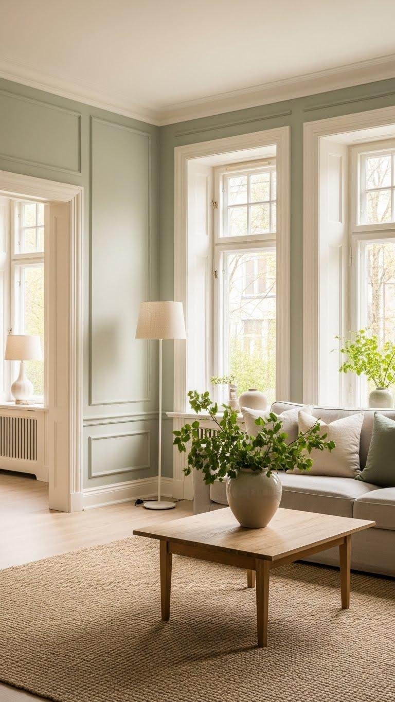
Add Muted Green Accents for Organic Calm

Slip in muted green accents to introduce an organic calm that complements greige without stealing the show. You’ll choose muted moss pillows, a herbal linen throw, or simple ceramic vases to ground the room.
These restrained greens feel liberating, not fussy—letting texture and light play while you enjoy a fresh, uncluttered space that breathes and invites easy living.
Layer Soft Taupes and Browns for Depth

When you layer soft taupes and warm browns, you create a quiet richness that gives a neutral scheme tangible depth without overwhelming the room. You’ll mix velvety taupe textiles, matte plaster walls, and hints of chocolate undertones in trim or accessories to sculpt space.
Keep contrasts subtle, vary textures, and let light reveal layered warmth that feels liberating and lived-in.
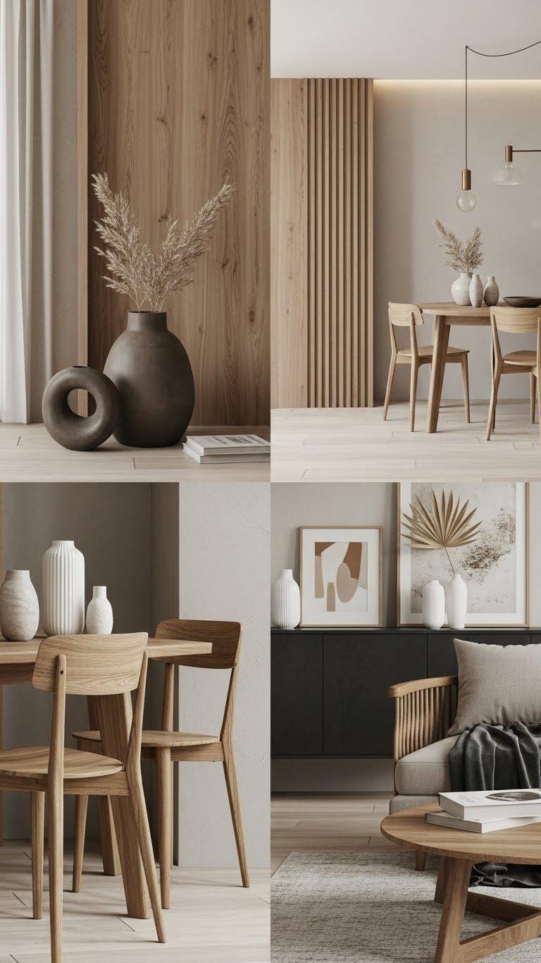
Choose Warm Brown Furnishings to Enrich Neutrals
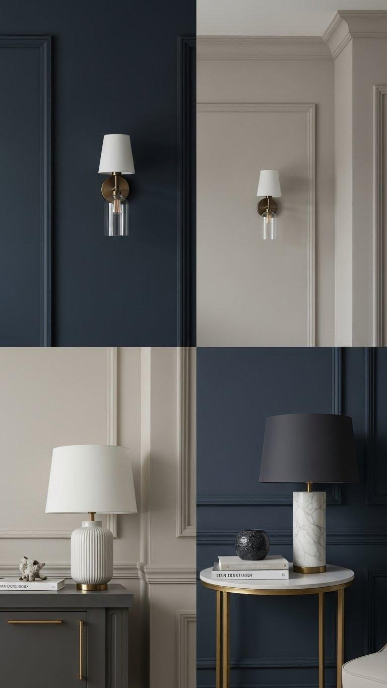
Use Refined Soft Accents Instead of Bold Black
Select Neutral Exterior Paints in Muted Earthy Tones
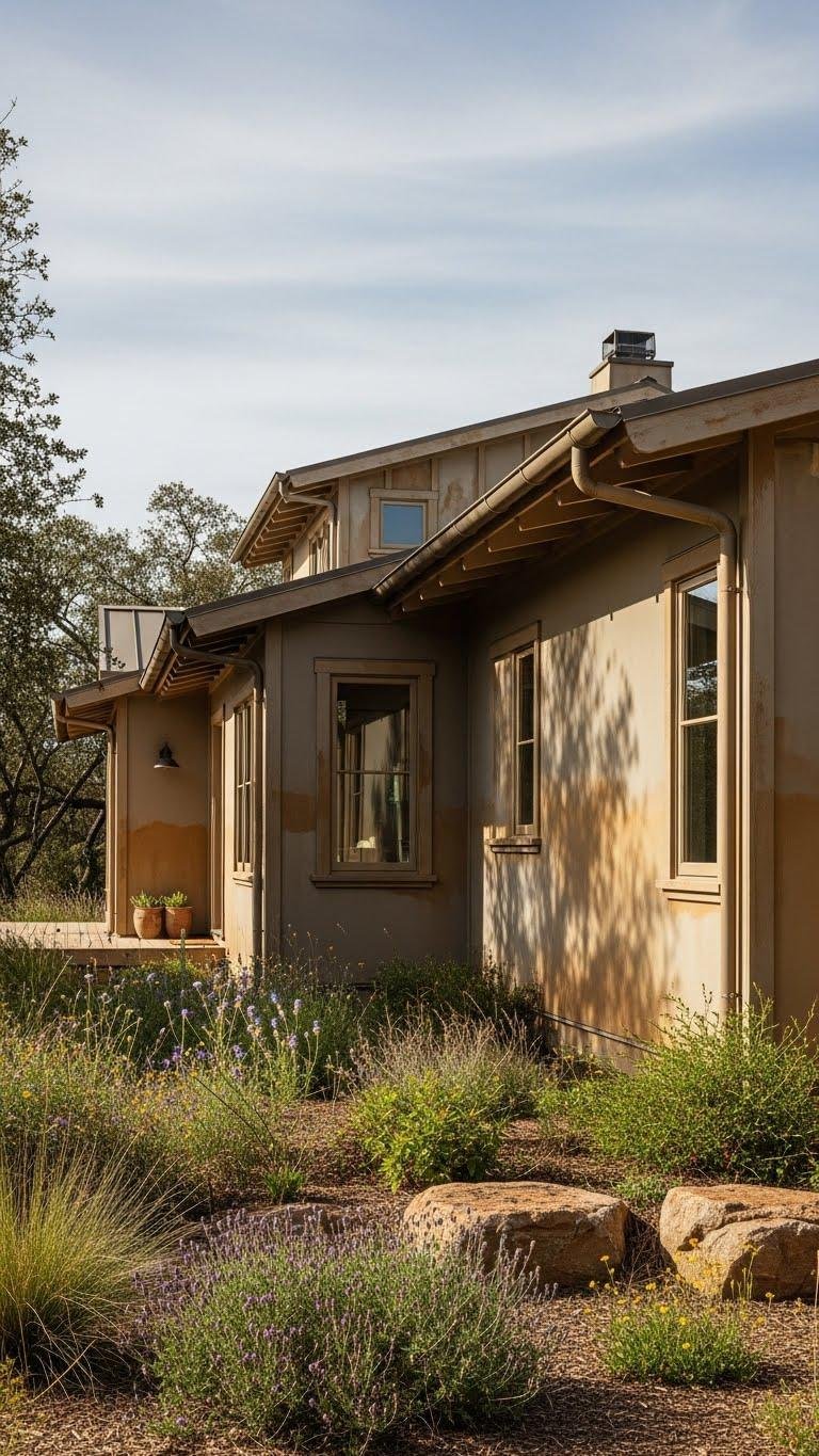
Because your home’s exterior is the first impression, choose muted earthy neutrals that connect the structure to its surroundings and hide wear gracefully.
Pick sun baked taupe for walls, pairing it with trim that shows an ochre undertone to warm entrances.
You’ll get a timeless, low-maintenance palette that reads relaxed and deliberate, freeing you from constant repainting while blending with landscape.
Create Seamless Open-Plan Flow With Coordinated Neutrals
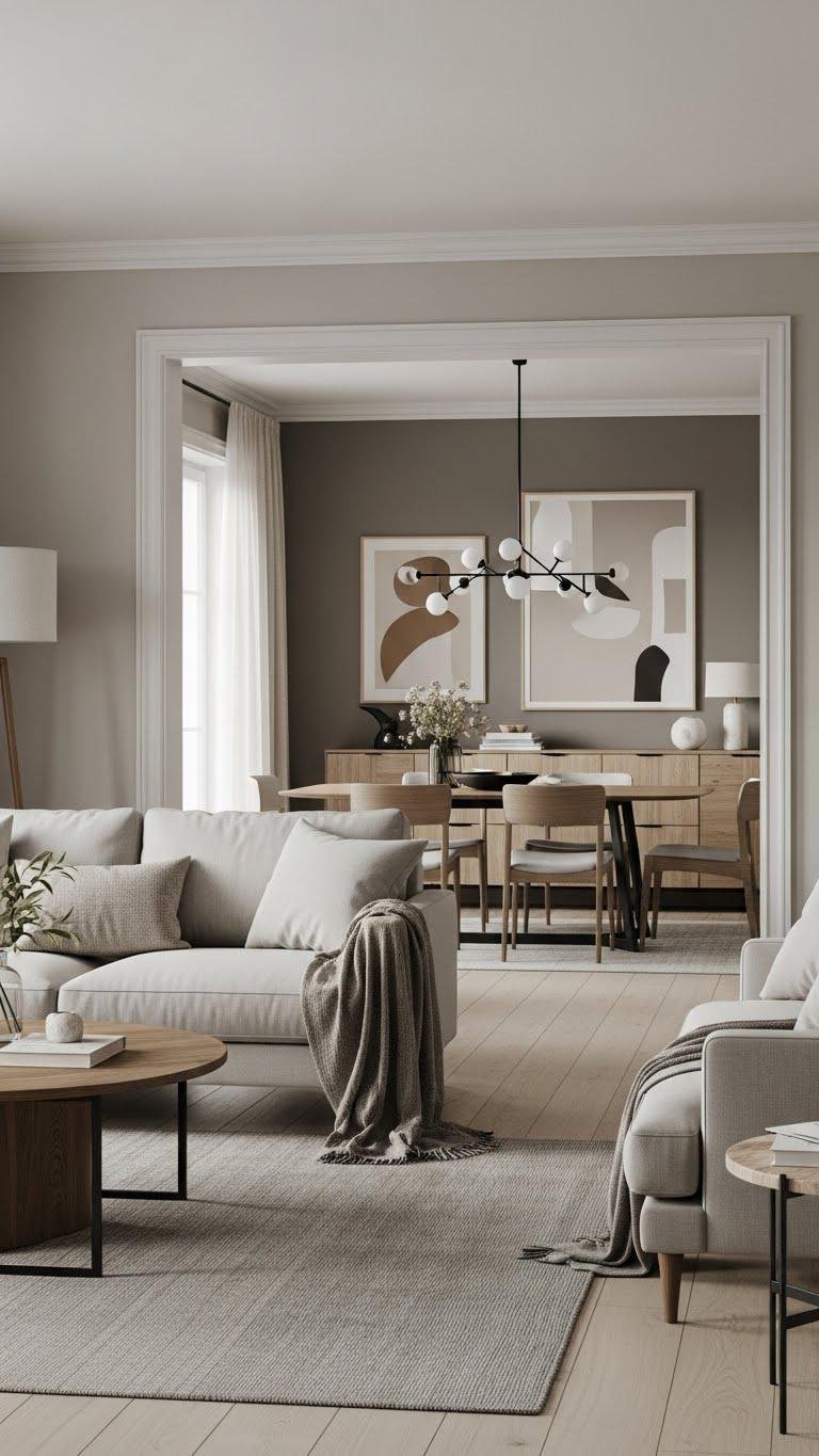
When rooms flow into one another, coordinated neutrals act like a visual thread that keeps the space feeling intentional; choose a restrained palette of three to four related hues—a dominant base, a slightly darker anchor, and one or two accents—to maintain continuity without monotony.
You’ll layer neutral textiles for softness and contrast, pick tonal furniture to define zones, and let light and texture create relaxed, unfettered movement.
Highlight Architecture With Subtle Neutral Millwork

After you’ve established a cohesive neutral palette across open rooms, let millwork quietly underscore the architecture without stealing the scene. You’ll emphasize architectural detailing with muted millwork tones that recede yet define.
Use cornice highlights to guide sightlines and subtle joinery to reveal craftsmanship. Keep profiles simple, finishes matte, and proportion balanced so spaces feel liberated, calm, and intentionally unfinished.
Introduce Deep Terracotta as a Grounding Accent

Anchor the neutral scheme with deep terracotta to bring warmth and tactile depth without overpowering the calm. Use rustic terracotta walls or an accent sofa to ground rooms, pair glazed ceramics for luminous contrast, and layer terracotta textiles for cozy freedom.
Favor matte finishes on trim and accessories to keep the look modern and restrained while letting the color anchor your palette confidently.
Use Pale Fresh Neutrals in Small Powder Rooms

Brighten up a tight powder room with pale, fresh neutrals that make the space feel larger and more serene. Let soft creams and cool beiges create compact elegance while you choose streamlined fixtures and minimal hardware.
Add mint accents sparingly—towels, a small vase—to inject calm without clutter. You’ll enjoy an airy, liberated washroom that feels both intentional and effortless.
Build a Whole-Home Palette of Complementary Neutrals
When you arrange a thoughtful, whole-home neutral palette, rooms flow into one another and your furnishings sing in harmony; start by choosing a core neutral—warm greige, cool taupe, or soft cream—and build three supporting tones (a lighter value, a midtone, and a deeper accent) to use consistently across finishes, upholstery, and textiles.
Then layer soft taupe, warm greys, neutral textiles, and a subtle ochre accent for freedom and cohesion.
Balance Natural Materials With Elevated Neutral Shades
Although natural materials bring tactile warmth and character to a room, you’ll want elevated neutral shades to refine the look and prevent it from feeling rustic or heavy.
Pair natural timber with crisp dove, warm greige, or soft taupe to keep lines modern.
Add raw linen accents for texture and lightness.
You’ll balance earthiness with sophistication while staying free and unfettered.
Layer Soft Sage Greens Into Neutral Schemes
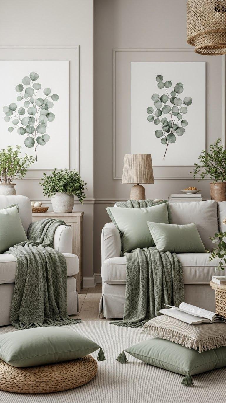
If you want to keep a neutral palette feeling fresh and grounded, layer soft sage greens as a subtle bridge between warm neutrals and cooler accents. You’ll introduce sage textiles—throws, cushions, curtains—to add depth without overpowering.
Pair with muted eucalyptus accents in art or botanicals for calm liveliness. The result’s relaxed, refined, and gives you freedom to shift tones seasonally.
Let Warm Whites Hold Up as Universal Trim Color
Sage greens add a soft, organic layer to a neutral scheme, but your trim sets the room’s framework and keeps everything feeling cohesive.
Choose a warm white trim; it softens contrasts and lets colors breathe. A creamy casing around doors and windows will elevate finishes without competing. Use that warm white trim consistently to unify spaces and give your home an open, liberated feel.
Transition Hues Room-to-Room for Cohesive Warmth
When you move from room to room, let color shifts be intentional and gentle so each space feels distinct yet part of a whole.
You’ll create soft progressions by nudging hue and temperature—warmer neutrals toward living areas, cooler taupes near bedrooms. Use trim, rugs, or art as tonal wayfinding cues so circulation feels effortless, coherent, and freeing without rigid matching.